SwiftUI TagsView
Picking back up my TaskManager app project, it’s time to start on the UI/UX portion. When working on how your app or even how a single view is going to look, it’s tempting to wait until everything is perfect before sharing it with stakeholders.
I’ve always found that a more iterative process works better. It may allow design and development to go back and forth on accessibility issues.
With that in mind, I write this as I try to illustrate some of the challenges in a simple reusable UI element in my current design.
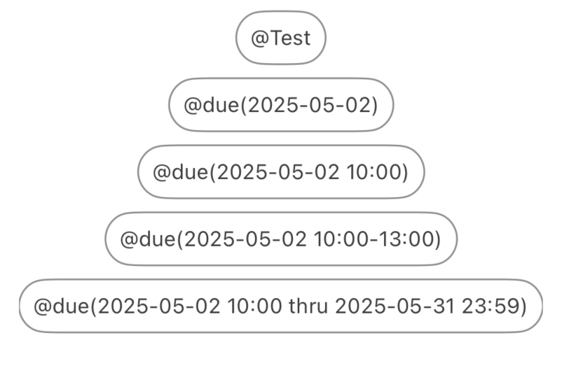
How a Tag data model will represented as a view.
All of the code for this blog post is in this sample code repo.
Tag Data Model
There are two types of tags: @tag or @tag(with content).
During the brainstorming session with design, we talked about these being configurable in the future so that specific tags may have different colors or that they’d interact with task items depending on their values.
To keep it simple, we had two known tags that have clear meanings:
-
duewhich will indicate that there’s a due date.- This could be an unspecific due date, such as following up on an email or a conversation
@due. - This could be a specific date date/time, such as being due on a specific date, date and time, an appointment, or a recurring appointment:
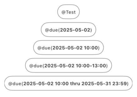
- Specific date:
@due(2025-05-11) - Specific date and time:
@due(2025-05-11 10:00) - An appointment with a date, time and end time:
@due(2025-05-11 13:00-14:00) - A recurring appointment:
@due(2025-05-12 13:00 thru 2025-05-19 23:59)
- Specific date:
- This could be an unspecific due date, such as following up on an email or a conversation
-
donewhich indicates that the task has been completed.- Typically, this is a simple specific done with a date to be able to tell when a task was accomplished:
@done(2025-05-11).
- Typically, this is a simple specific done with a date to be able to tell when a task was accomplished:
The concept of a tag means that they can be any string depending on how the user may want to categorize things, such as @work, @home, @self, etc…
It was decided that in the interest of streamlining an MVP (Minimally Viable Product), the app wouldn’t support colors at this point.
First Pass at the UI.
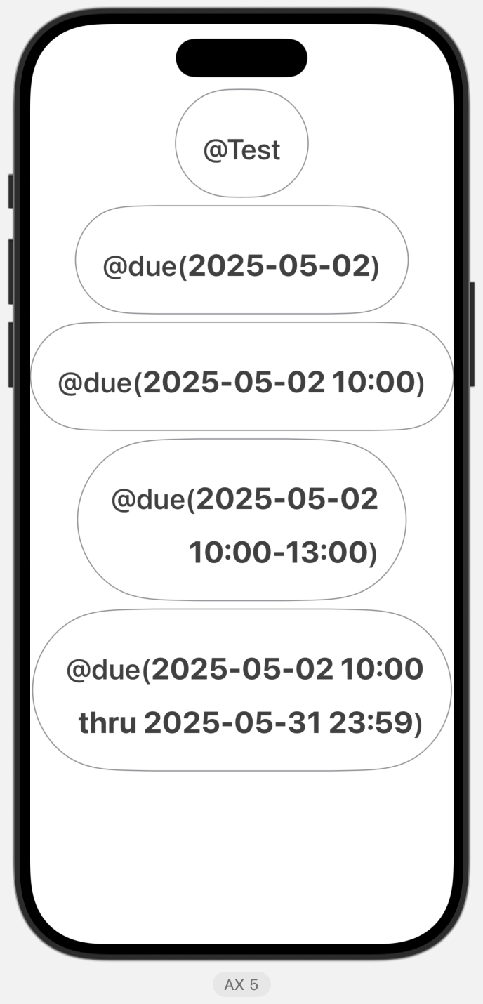
Design wanted a simple view of the @tag or @tag(content) in the .caption font with a capsule shape around it.
In my code base, I defined some constants to simplify my life: Spacing constants building around a default of 8 (default, half, double, triple, or quadruple) for some of the spacing that we want around various visual elements. We also defined specific colors that can be reused in multiple places: border color (gray), tint color (black), and standard tag color (black.opacity(0.75)). This ensures that should we want to change things, we can change the constant and it changes the color everywhere in the app.
struct TagView: View {
    let tag: Tag
    var body: some View {
        Group {
            if let payload = tag.payload {
                Text("@\(tag.tag)(\(payload))")
            } else {
                Text("@\(tag.tag)")
            }
        }
        .font(.caption)
        .foregroundColor(Color.Tag.default)
        .padding(Spacing.default)
        .overlay(
            Capsule()
                .stroke(Color.Tag.border, lineWidth: 1)
        )
    }
}
As you can see, it looks okay, but it might be nice to draw the eye to the tag’s payload:
Tweak to add some highlighting to the payloads.
My first thought was to shift the payload Text view into an HStack, where I’d have multiple elements and the multiple font calls with the different font weight to bolden the payload.
	HStack {
	  Text("@\(tag.tag)(")
		.font(.caption)
	  Text("\(payload)")
	    .font(.caption.bold())
	  Text(")")
	    .font(.caption)
	}
From the look of it, it seemed okay:
But I felt that this was overly complicated. A better solution was much simpler. Since iOS 15, SwiftUI supports Markdown. The solution was to just change the appropriate Text() view definition.
Text("@\(tag.tag)(**\(payload)**)")Now we’ve got highlighted payloads:
Challenges
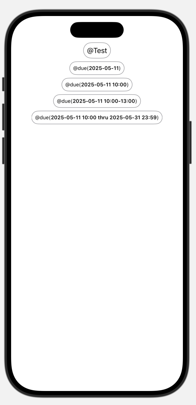
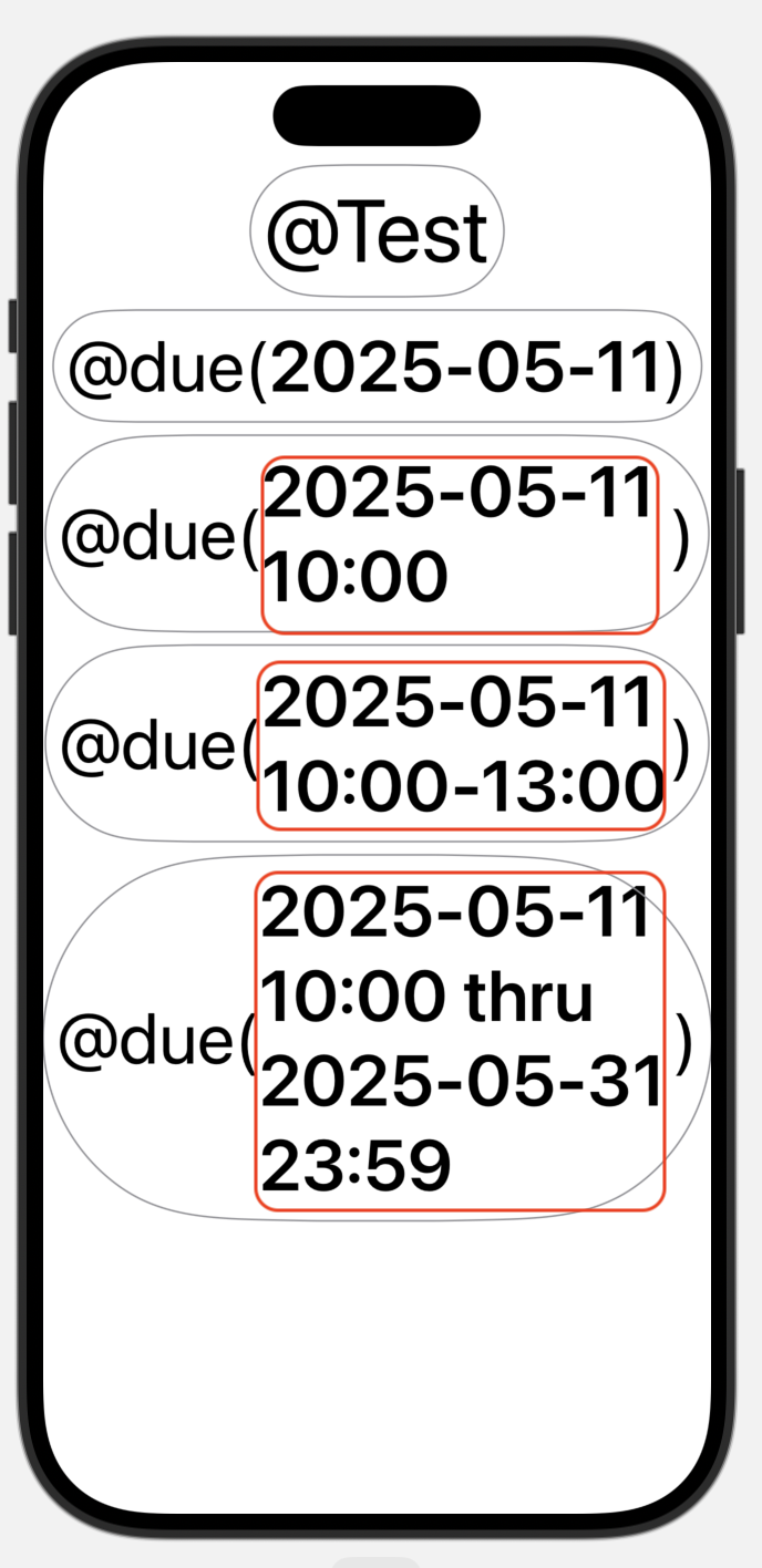
When verifying how a view will look, I like to check the usual light mode/dark mode and with Dynamic Type fonts. For the most part it works, but for the larger fonts, it’s clear that a bit more work is needed:
There are some obvious issues with the padding that affected capsule shape around the larger text, as well as the how the text wraps.
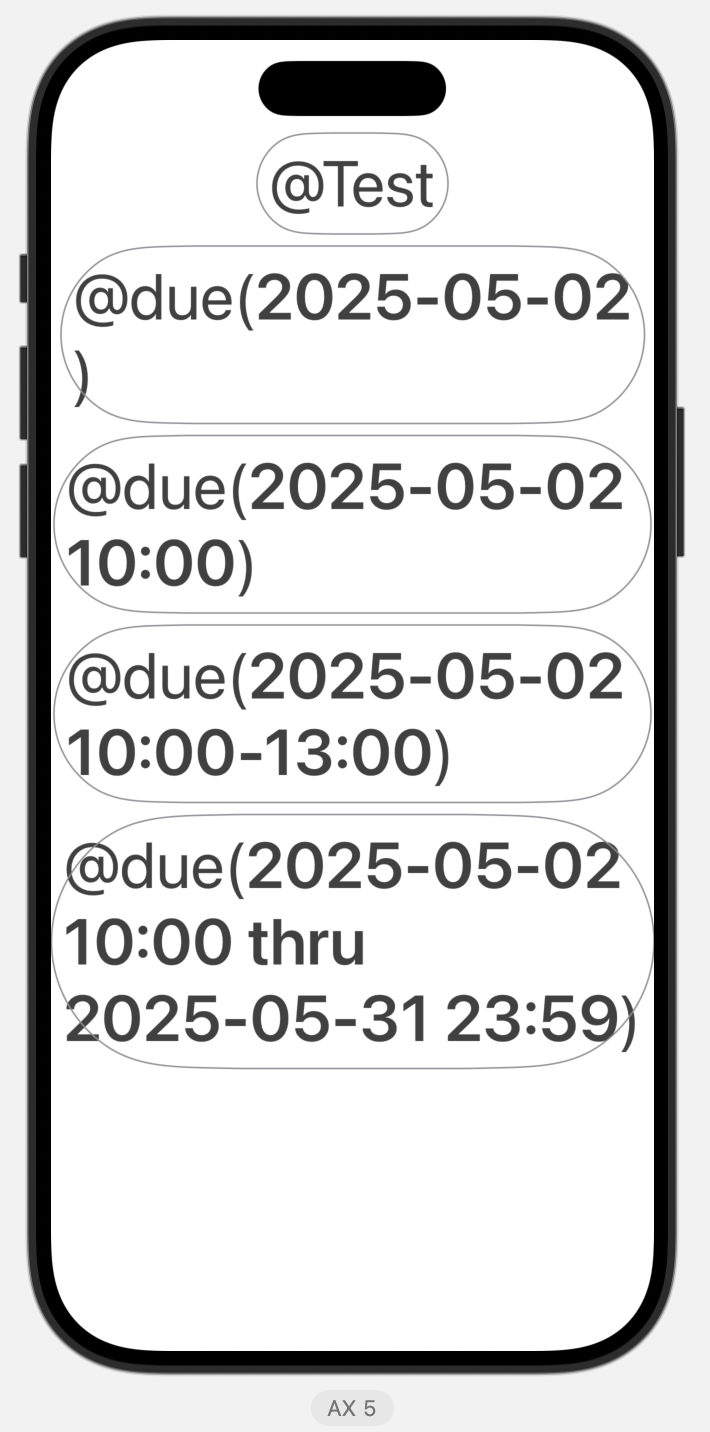
HStack Version
If we had gone with the HStack version, it was even more problematic, as only the payload was wrapping, which lead to an odd look:
Padding
Once again, Apple was already there. By changing leveraging the @ScaledMetric to our default spacing, it will scale with the font.
    // Both of these are equivalent
    @ScaledMetric private var scaledPaddingBase1: CGFloat = Spacing.default
    @ScaledMetric(relativeTo: .body) private var scaledPaddingBase2: CGFloat = Spacing.default
    // As we're using the caption font, we base our changes to that.
    @ScaledMetric(relativeTo: .caption) private var scaledPadding: CGFloat = Spacing.default

    // Then we can just change our padding to use the appropriate scaled padding variable.
    // ...
        .padding(scaledPadding)
Wrapping and Scaling
Similarly, this was just a matter of adding some modifiers to our Text view.
        .font(.caption)
        .textScale(.secondary)
        .foregroundColor(Color.Tag.default)
        .tint(Color.Tag.tint)
        .multilineTextAlignment(.trailing)
        .padding(scaledPadding)
        .overlay(
            Capsule()
                .stroke(Color.Tag.border, lineWidth: 1)
        )
The .textScale(.secondary) gave it the look that I liked even for the largest possible font size and by controlling the wrapping with .multilineTextAlignment, the text wrapped a little closer to what I wanted to see.
Next week, we will continue working on the UI layer and delving deeper into the SwiftUI of it all. How do you create a reusable SwiftUI element and trigger the UX changes when it’s interacted with.